


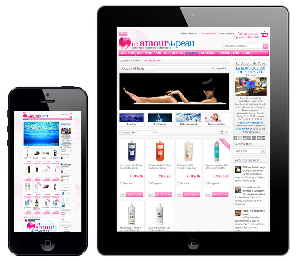
Today, consultation of the websites is done mainly via tablets and smartphones. A trend that is not ready to reverse… It is therefore important that your site has the same look some – are used terminals…
Thus, your website will adapt to several dimensions of screen, such tablets and smartphones. The layout of a responsive site requires the provision of the various elements that make up the site in order to have all the features a few are the sizes and resolutions of monitors and not be penalized by Google in terms of search engine optimization.

.
.
.
.
.
.